About the Bland-Altaman Plot
A Bland–Altman plot (difference plot) in analytical chemistry or biomedicine is a method of data plotting used in analyzing the agreement between two different assays. It is identical to a Tukey mean-difference plot, the name by which it is known in other fields, but was popularised in medical statistics by J. Martin Bland and Douglas G. Altman.
Consider a sample consisting of observations (for example, objects of unknown volume). Both assays (for example, different methods of volume measurement) are performed on each sample, resulting in data points. Each of the samples is then represented on the graph by assigning the mean of the two measurements as the -value, and the difference between the two values as the -value.
The Cartesian coordinates of a given sample with values of and determined by the two assays is
For comparing the dissimilarities between the two sets of samples independently from their mean values, it is more appropriate to look at the ratio of the pairs of measurements. Log transformation (base 2) of the measurements before the analysis will enable the standard approach to be used; so the plot will be given by the following equation:
This version of the plot is used in MA plot.
Draw B-A Plot with R
Data is from original 1986 Lancet paper1, you can download it on Github
data <- read.csv("data.csv")
head(data)
WrightFirst WrightSecond MiniWrightFirst MiniWrightSecond
1 494 490 512 525
2 395 397 430 415
3 516 512 520 508
4 434 401 428 444
5 476 470 500 500
6 557 611 600 625With Library BlandAltmanLeh
library(BlandAltmanLeh)
bland.altman.plot(data$WrightFirst, data$MiniWrightFirst,
                  main = "Bland-Altman Plot: WrightFirst vs MiniWrightFirst",
                  xlab = "Mean of WrightFirst and MiniWrightFirst",
                  ylab = "Difference (WrightFirst - MiniWrightFirst)")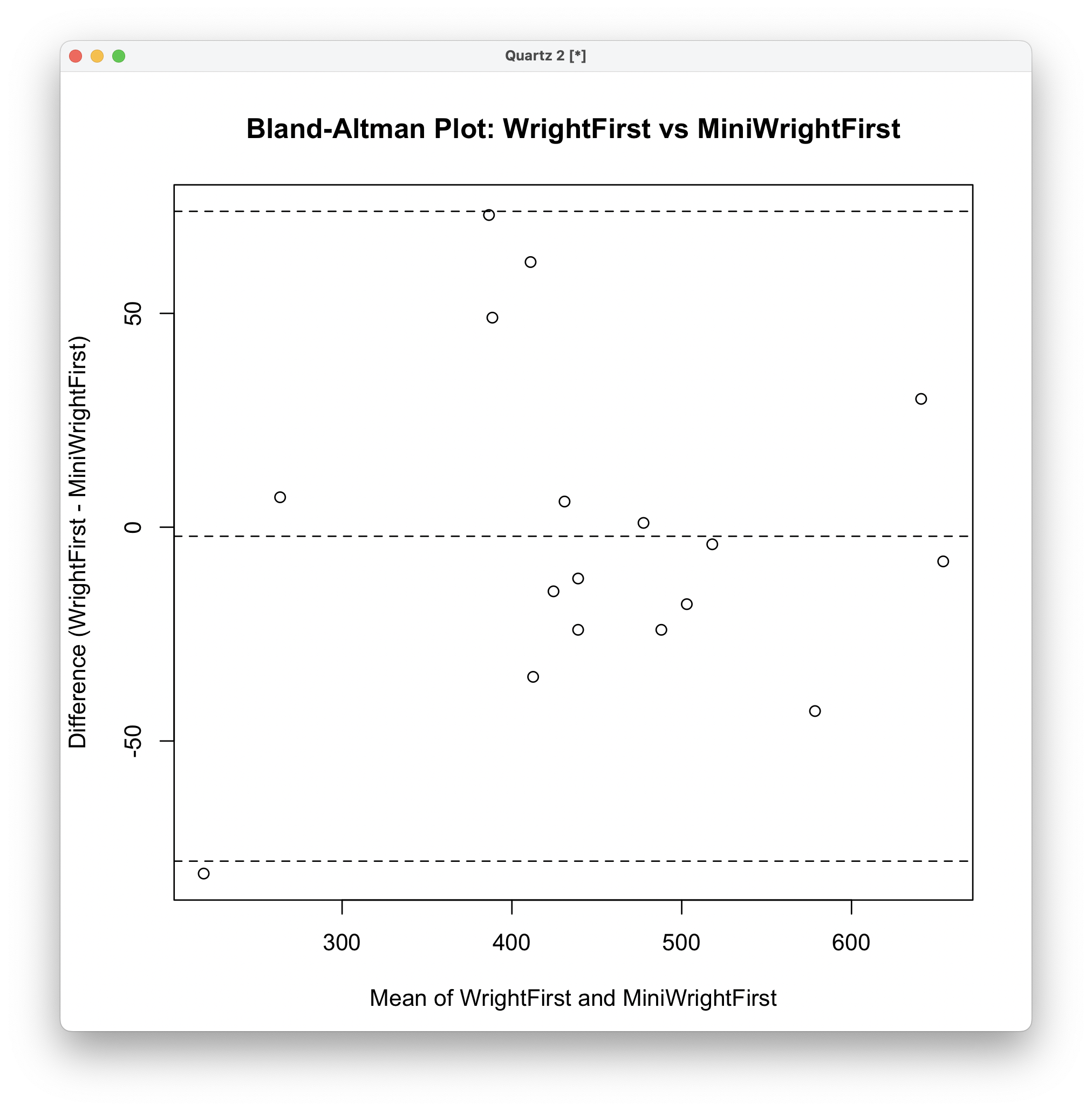
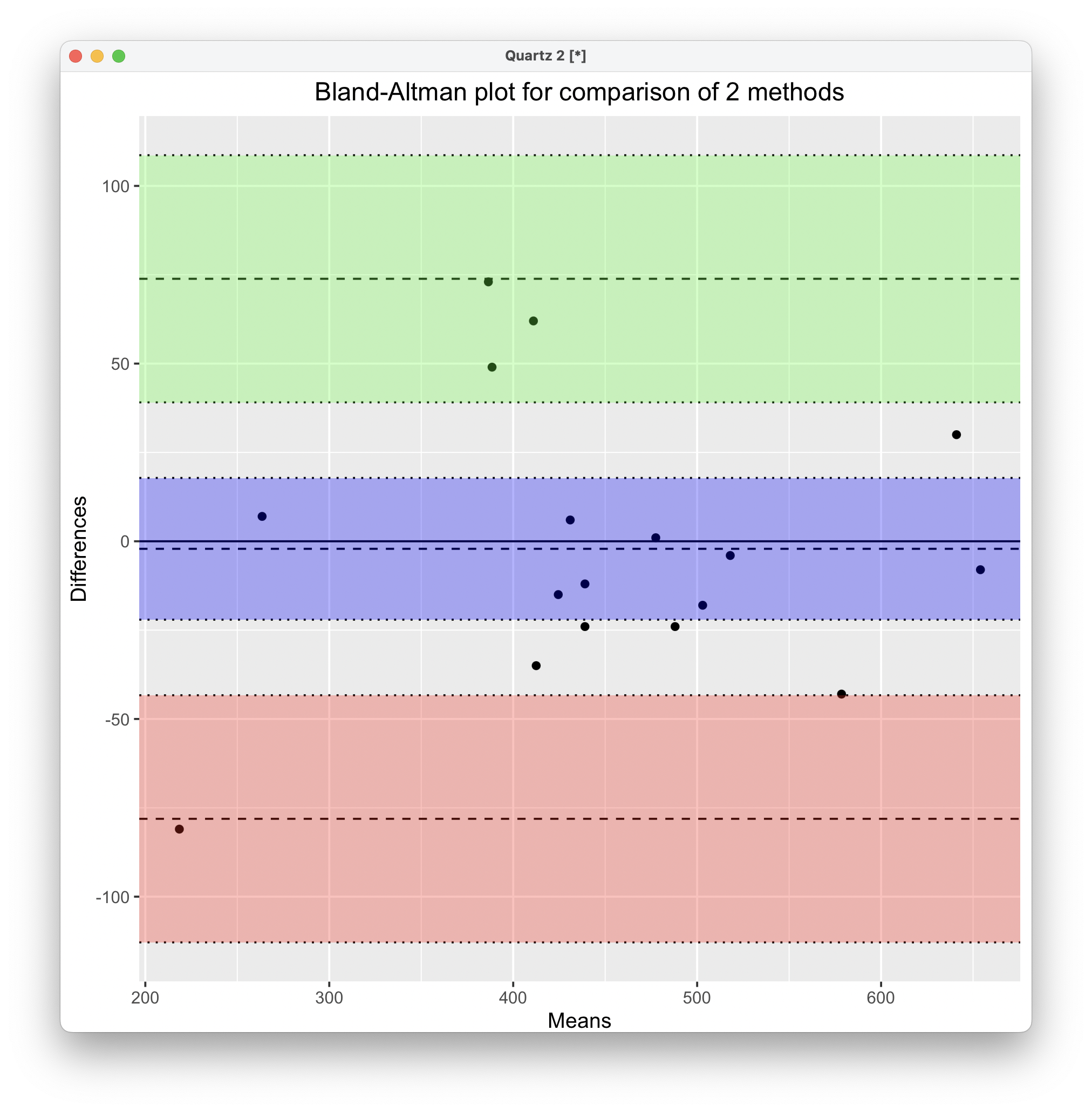
With Library blandr
library(blandr)
blandr.draw(
  method1 = data$WrightFirst,
  method2 = data$MiniWrightFirst
)
Beautify with ggplot2
library(ggplot2)

my_purple <- "#956daf"

# Load your data
data <- read.csv("data.csv") # Assuming your data is in a CSV file named data.csv

# Calculate the difference and mean
mean_values <- (data$WrightFirst + data$MiniWrightFirst) / 2
diff_values <- data$WrightFirst - data$MiniWrightFirst

# Calculating consistency bounds
mean_diff <- mean(diff_values)
sd_diff <- sd(diff_values)
upper_limit <- mean_diff + 1.96 * sd_diff
lower_limit <- mean_diff - 1.96 * sd_diff

p <- ggplot(data.frame(mean_values, diff_values), aes(x = mean_values, y = diff_values)) +
  geom_point(size = 9, color = "#86d5bc", alpha = .7) +
  geom_hline(aes(yintercept = mean_diff), color = "black", size = 1.2, linetype = "solid") +
  geom_hline(aes(yintercept = lower_limit), color = my_purple, size = 1.2, linetype = "dashed") +
  geom_hline(aes(yintercept = upper_limit), color = my_purple, size = 1.2, linetype = "dashed") +
  geom_text(aes(x = Inf, y = mean_diff, label = sprintf("Mean = %.3f", mean_diff)),
            hjust = 1.1, vjust = 1.5, color = "black", size = 12, family = "Arial") +
  geom_text(aes(x = Inf, y = lower_limit,
                label = sprintf("-1.96 SD = %.3f", lower_limit)),
            hjust = 1.1, vjust = 1.5, color = my_purple, size = 12, family = "Arial") +
  geom_text(aes(x = Inf, y = upper_limit,
                label = sprintf("+1.96 SD = %.3f", upper_limit)),
            hjust = 1.1, vjust = -0.5, color = my_purple, size = 12, family = "Arial") +
  labs(x = "Means", y = "Differences") +
  scale_y_continuous(limits = c(-100, 100)) +
  theme_test(
      base_line_size = 2,
      base_rect_size = 3,
      base_family = "Arial"
    ) +
      theme(
        # Font size of axis
        axis.title.x = element_text(size=42, color = "black", family = "Arial"),
        axis.text.x = element_text(size=32, color = "black", family = "Arial"),
        axis.text.y = element_text(size=32, color = "black", family = "Arial"),
        axis.title.y = element_text(size=42, color = "black", family = "Arial"),
        # Set ticks to minus
        axis.ticks.length.y = unit(-0.5, 'cm'),
        axis.ticks.length.x = unit(-0.5, 'cm'),
        # Minor ticks
        axis.minor.ticks.length.y = unit(-0.3, 'cm'),
  )

ggsave("Bland-Altman.png", height = 8, width = 10, dpi = 300, plot = p)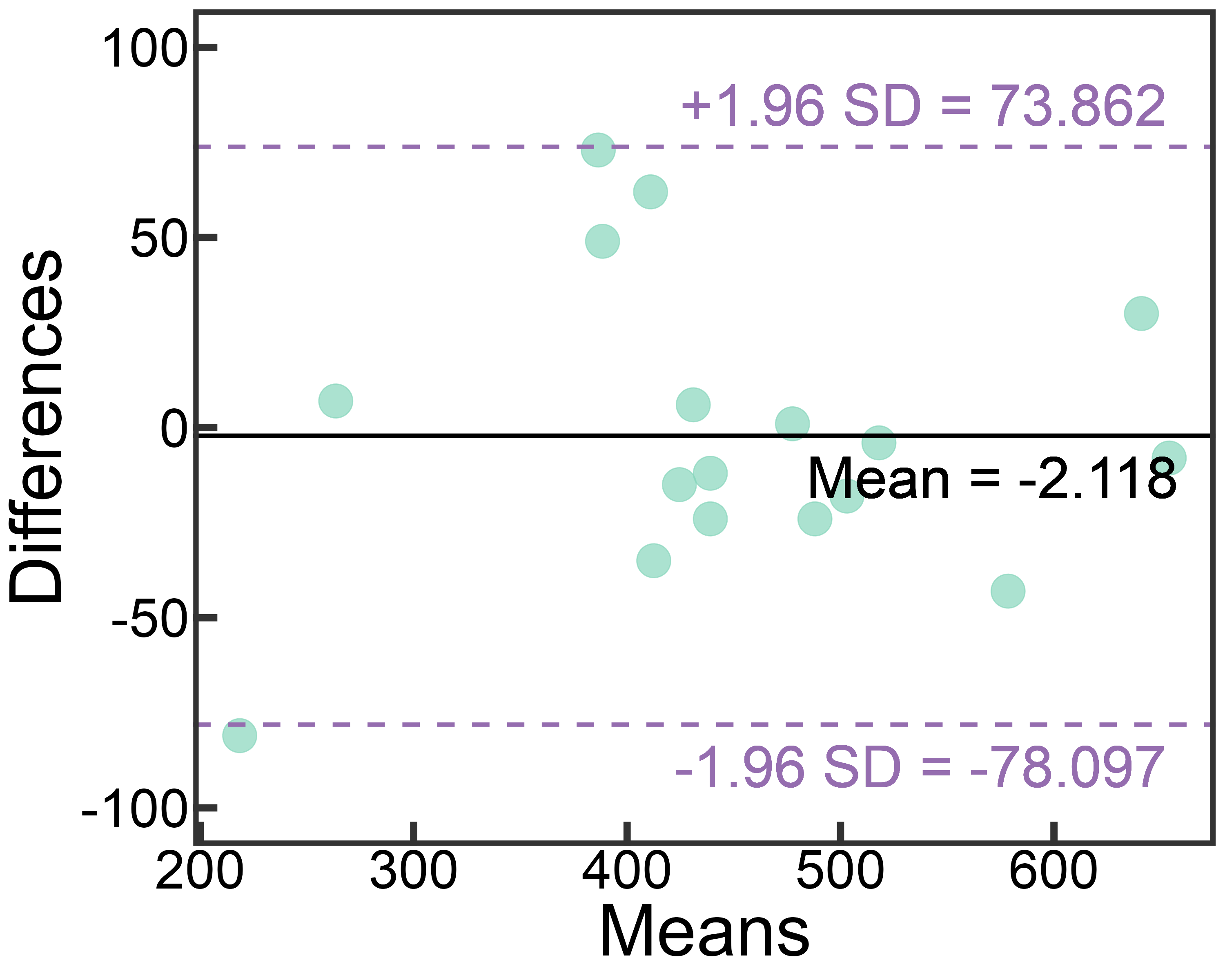
Draw B-A Plot with Python
import pandas as pd
import numpy as np
import matplotlib.pyplot as plt
import seaborn as sns

# Load data
data = pd.read_csv('data.csv')

# Calculate the difference and mean
data['mean'] = (data['WrightFirst'] + data['MiniWrightFirst']) / 2
data['diff'] = data['WrightFirst'] - data['MiniWrightFirst']

mean_diff = np.mean(data['diff'])
std_diff = np.std(data['diff'], ddof=1)

# Calculating consistency bounds
upper_limit = mean_diff + 1.96 * std_diff
lower_limit = mean_diff - 1.96 * std_diff

# Set plot style
sns.set(style="whitegrid")

plt.figure(figsize=(10, 6))

# Scatter plot
sns.scatterplot(x='mean', y='diff', data=data, color='blue', s=50)

# Plotting mean lines and consistency limits
plt.axhline(mean_diff, color='red', linestyle='--', linewidth=2, label='Mean difference')
plt.axhline(upper_limit, color='red', linestyle='--', linewidth=1, label='Upper limit of agreement')
plt.axhline(lower_limit, color='red', linestyle='--', linewidth=1, label='Lower limit of agreement')
# Title and label
plt.title('Bland-Altman Plot: WrightFirst vs MiniWrightFirst', fontsize=16)
plt.xlabel('Mean of WrightFirst and MiniWrightFirst', fontsize=14)
plt.ylabel('Difference (WrightFirst - MiniWrightFirst)', fontsize=14)
# Legend
plt.legend()

plt.show()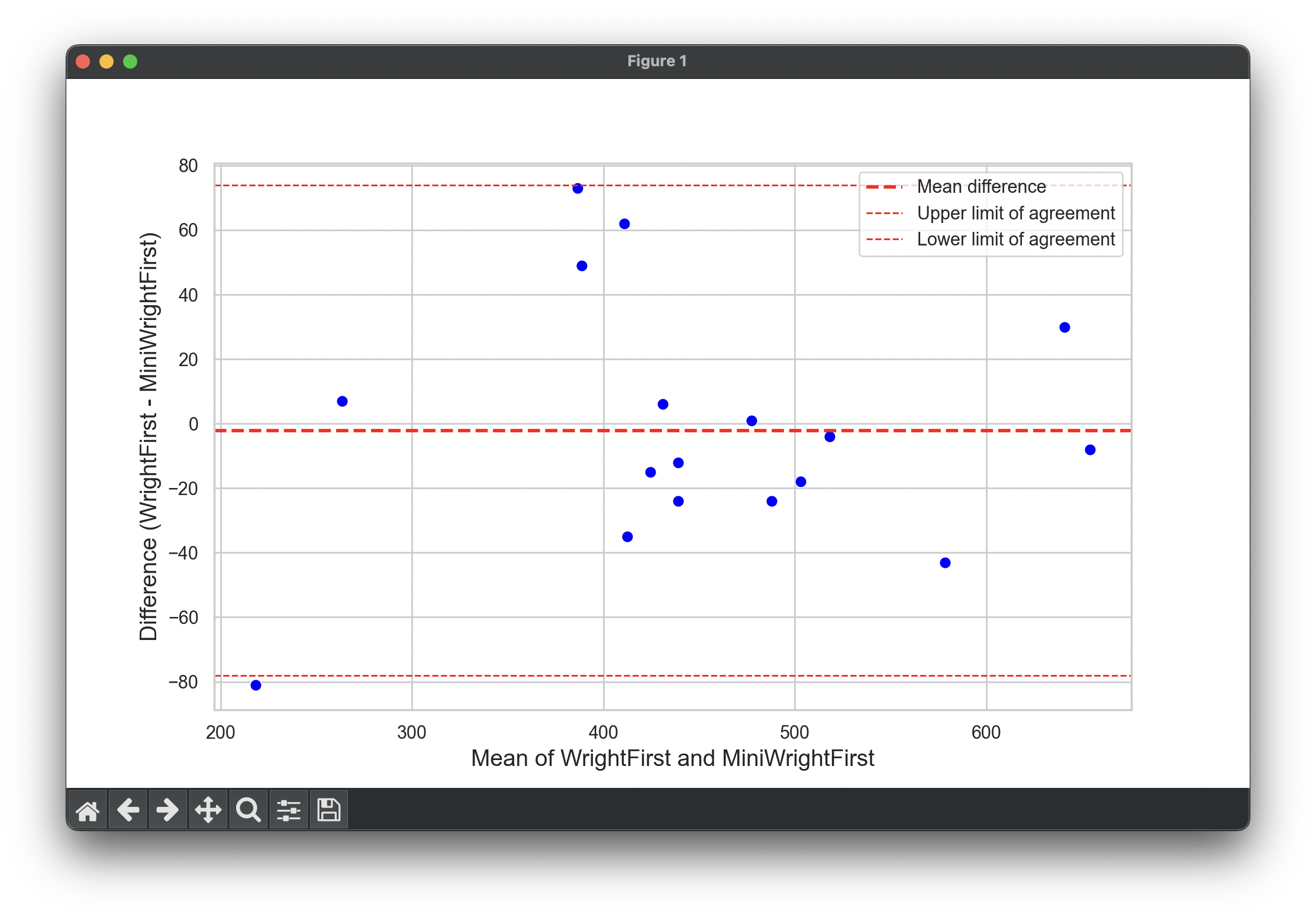
Draw B-A Plot with MATLAB
% Load data
data = readtable('data.csv');

% Calculate the difference and mean
meanValues = (data.WrightFirst + data.MiniWrightFirst) / 2;
diffValues = data.WrightFirst - data.MiniWrightFirst;

meanDiff = mean(diffValues);
stdDiff = std(diffValues);

% Calculating consistency bounds
upperLimit = meanDiff + 1.96 * stdDiff;
lowerLimit = meanDiff - 1.96 * stdDiff;

figure;
hold on;

% Scatter plot
scatter(meanValues, diffValues, 'filled');
xlabel('Mean of WrightFirst and MiniWrightFirst');
ylabel('Difference (WrightFirst - MiniWrightFirst)');
title('Bland-Altman Plot: WrightFirst vs MiniWrightFirst');

% Plotting mean lines and consistency limits
line([min(meanValues) max(meanValues)], [meanDiff meanDiff], 'Color', 'red', 'LineStyle', '--', 'LineWidth', 2);
line([min(meanValues) max(meanValues)], [upperLimit upperLimit], 'Color', 'red', 'LineStyle', '--', 'LineWidth', 1);
line([min(meanValues) max(meanValues)], [lowerLimit lowerLimit], 'Color', 'red', 'LineStyle', '--', 'LineWidth', 1);

% Lengend
legend('Data Points', 'Mean Difference', 'Upper Limit of Agreement', 'Lower Limit of Agreement');

hold off;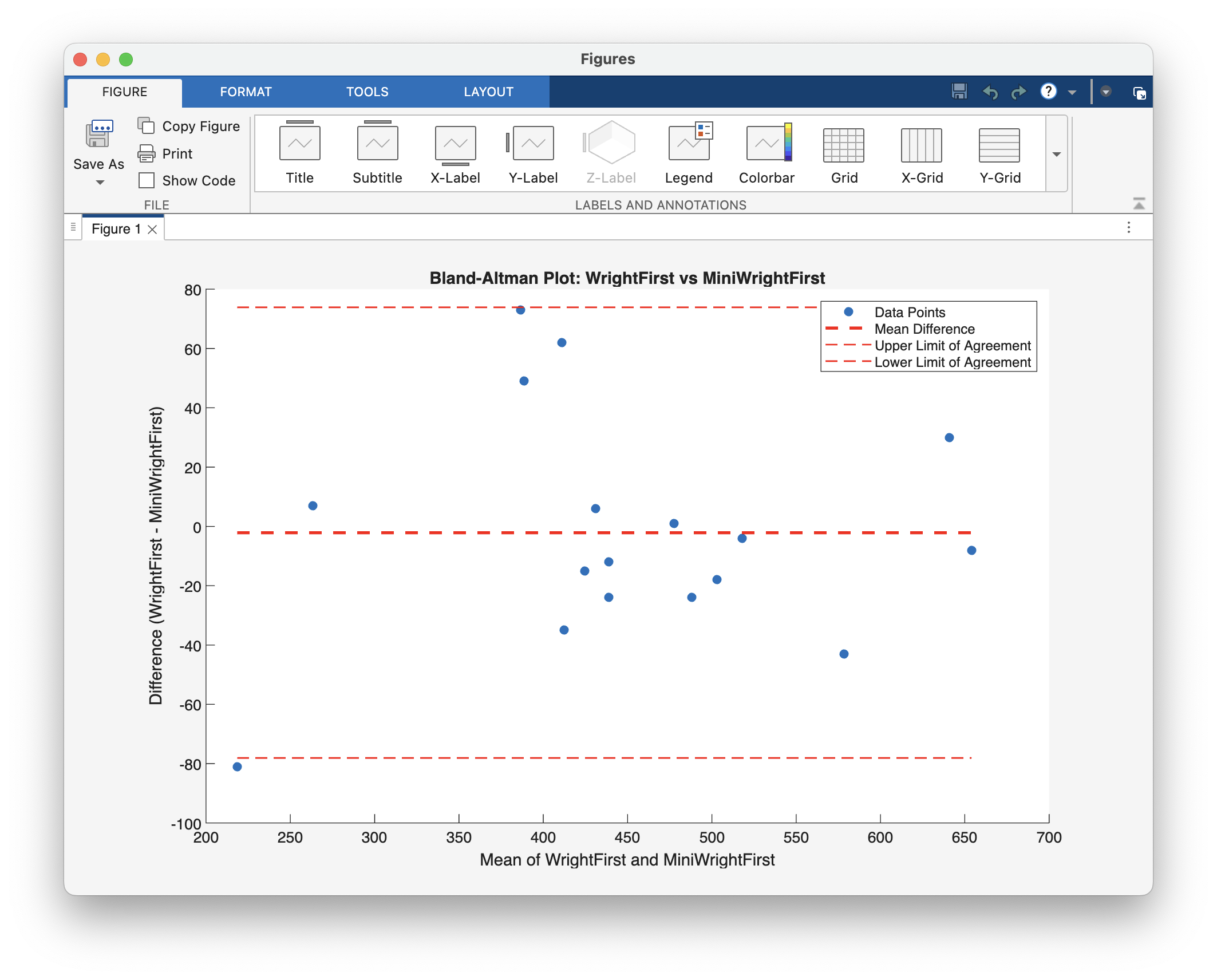
Footnotes
-
Bland, J. M., & Altman, D. (1986). Statistical methods for assessing agreement between two methods of clinical measurement. The lancet, 327(8476), 307-310. ⤴