About Ternary Phase Diagram
A ternary plot, ternary graph, triangle plot, simplex plot, or Gibbs triangle is a barycentric plot on three variables which sum to a constant.[1] It graphically depicts the ratios of the three variables as positions in an equilateral triangle. It is used in physical chemistry, petrology, mineralogy, metallurgy, and other physical sciences to show the compositions of systems composed of three species. Ternary plots are tools for analyzing compositional data in the three-dimensional case.
In population genetics, a triangle plot of genotype frequencies is called a de Finetti diagram. In game theory[2] and convex optimization,[3] it is often called a simplex plot.
In a ternary plot, the values of the three variables a, b, and c must sum to some constant, K. Usually, this constant is represented as 1.0 or 100%. Because for all substances being graphed, any one variable is not independent of the others, so only two variables must be known to find a sample’s point on the graph: for instance, must be equal to . Because the three numerical values cannot vary independently—there are only two degrees of freedom—it is possible to graph the combinations of all three variables in only two dimensions.
The advantage of using a ternary plot for depicting chemical compositions is that three variables can be conveniently plotted in a two-dimensional graph. Ternary plots can also be used to create phase diagrams by outlining the composition regions on the plot where different phases exist.
The values of a point on a ternary plot correspond (up to a constant) to its trilinear coordinates or barycentric coordinates.
Example data is from R library ggtern, you can obtain it with
library(ggtern)
data("Feldspar")
head(Feldspar)
write.csv(Feldspar, "data.csv", row.names=FALSE)
Experiment Feldspar Ab Or An T.C P.Gpa
17 G5 Alkalai 0.333 0.657 0.010 700 0.3
18 A4 Alkalai 0.331 0.658 0.011 700 0.3
20 G10-9 Alkalai 0.232 0.763 0.005 650 0.3
38 A4 Plagioclase 0.763 0.072 0.165 700 0.3
40 G10-9 Plagioclase 0.772 0.060 0.168 650 0.3
7 K1 Alkalai 0.282 0.700 0.018 800 0.2Drawing Ternary Phase Diagram with R
With Library ggtern
Basic Type
library(ggtern)

data = read.csv("data.csv")

ggtern(data, aes(Or, Ab, An)) +
  geom_point()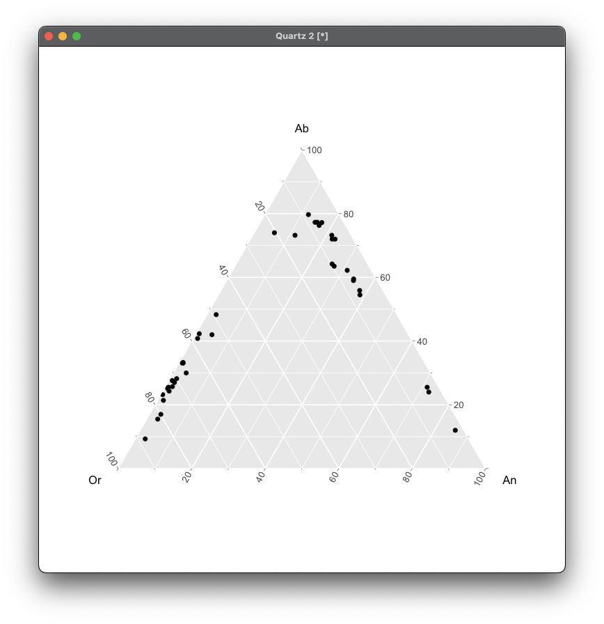
Color by Temperature (T.C)
library(ggtern)

data = read.csv("data.csv")

ggtern(data, aes(Or, Ab, An)) +
  geom_point(aes(color = T.C))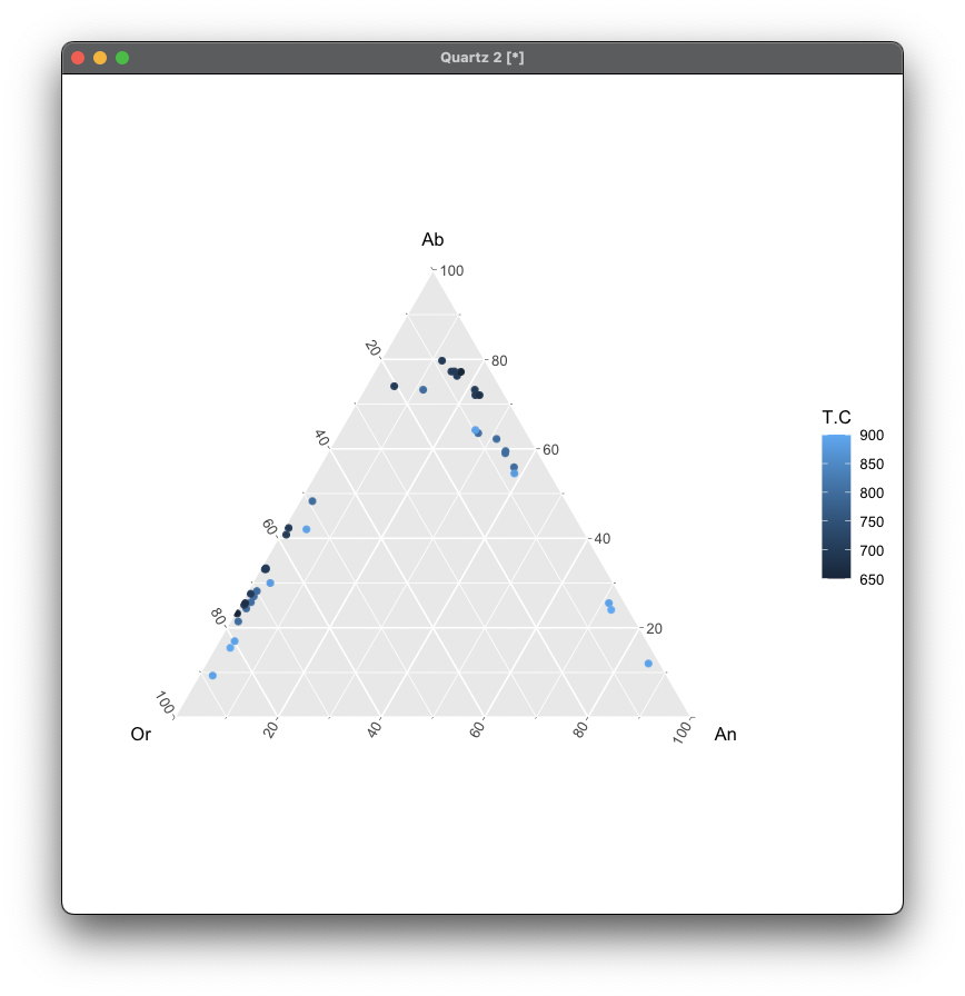
Faceting by Feldspar Type
ggtern(data, aes(x = Ab, y = Or, z = An)) +
  geom_point(aes(color = T.C)) +
  facet_wrap(~ Feldspar) +
  scale_color_gradient(low = "#009FFF", high = "#ec2F4B")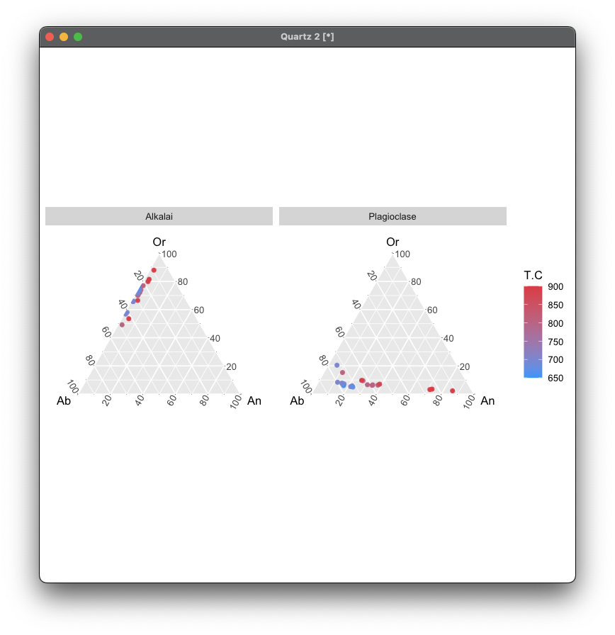
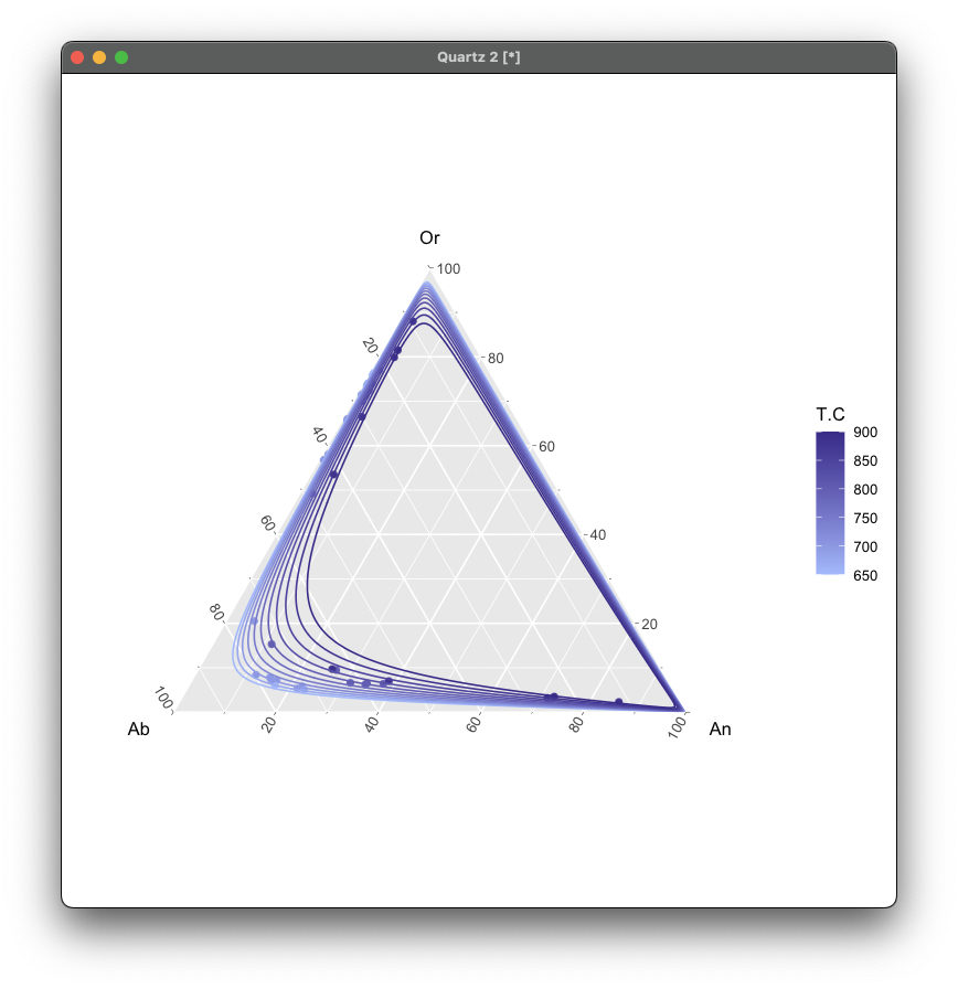
Draw Contour Lines
library(ggtern)
library(ggplot2)

ggtern(df, aes(Ab, Or, An)) +
  geom_point(aes(color = T.C)) +
  stat_interpolate_tern(
    aes(value = T.C, colour = after_stat(level)),
    formula = value ~ polym(x, y, degree = 2, raw = TRUE),
    method  = "lm",
    n       = 200,
    breaks  = seq(650, 900, 25),
    size    = 0.4
  ) +
  scale_color_gradient(
    low = "#a8c0ff",
    high = "#3f2b96"
  )
With Library Ternary
library(Ternary)
data <- read.csv("data.csv")

TernaryPlot(alab = "Ab", blab = "Or", clab = "An")
TernaryPoints(data[, c("Ab", "Or", "An")], pch = 16)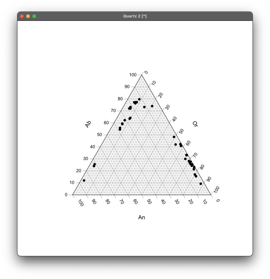
Color by Feldspar
TernaryPlot(alab = "Ab", blab = "Or", clab = "An")
cols <- ifelse(df$Feldspar == "Alkalai", "#953984", "#ffc82d")
TernaryPoints(df[, c("Ab", "Or", "An")], col = cols, pch = 16)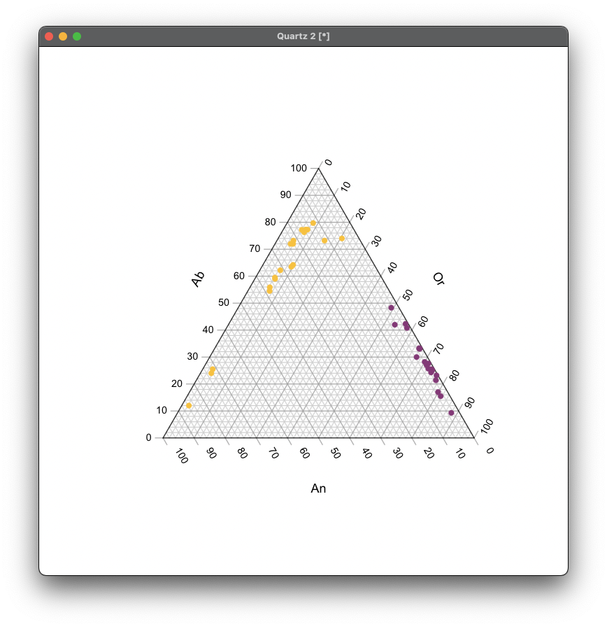
Drawing Ternary Phase Diagram with Python
import pandas as pd

df = pd.read_csv('data.csv')
Basic Type
import matplotlib.pyplot as plt
import ternary

cols = ['Ab', 'Or', 'An']
points = df[cols].to_numpy()

# Canvas and axes
fig, ax = plt.subplots(figsize=(6, 5))
tax = ternary.TernaryAxesSubplot(ax=ax, scale=1.0)

# Boundary and grid
tax.boundary(lw=1.2)
tax.gridlines(multiple=0.2, lw=0.5, alpha=0.5)

# Scatter points
tax.scatter(points)

# Labels
tax.set_title("Ab–Or–An Ternary (Basic)")
tax.left_axis_label("Or", fontsize=12)
tax.right_axis_label("An", fontsize=12)
tax.bottom_axis_label("Ab", fontsize=12)

tax.tight_layout()
plt.show()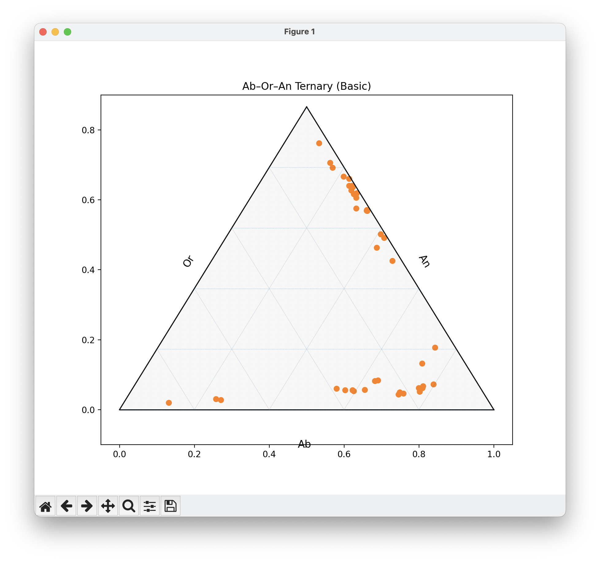
Add Legends, Color Scales, and Temperature Maps
import numpy as np

# Maps
cmap = plt.get_cmap('coolwarm')
norm = plt.Normalize(vmin=df['T.C'].min(), vmax=df['T.C'].max())

# Group
p_groups = df.groupby('P.Gpa')

fig, ax = plt.subplots(figsize=(6,5))
tax = ternary.TernaryAxesSubplot(ax=ax, scale=1.0)
tax.boundary(lw=1.2)
tax.gridlines(multiple=0.2, lw=0.5, alpha=0.5)

markers = ['o','s','^']  # 0.1, 0.2, 0.3 Gpa
for (pval, grp), m in zip(p_groups, markers):
    sub = grp[['Ab','Or','An']].to_numpy()
    colors = cmap(norm(grp['T.C']))
    tax.scatter(sub, color=colors, marker=m, s=35,
                label=f'{pval} GPa', edgecolors='k', lw=0.3)

# Color scales
sm = plt.cm.ScalarMappable(cmap=cmap, norm=norm)
sm.set_array([])
cb = fig.colorbar(sm, ax=ax, shrink=0.6, pad=0.1)
cb.set_label('Temperature (°C)')

# Legend
tax.legend(title='Pressure', loc='upper right', bbox_to_anchor=(1.25,1))
tax.set_title("Ab–Or–An  (colored by T, shaped by P)")
tax.left_axis_label("Or"); tax.right_axis_label("An"); tax.bottom_axis_label("Ab")
tax.tight_layout()
plt.show()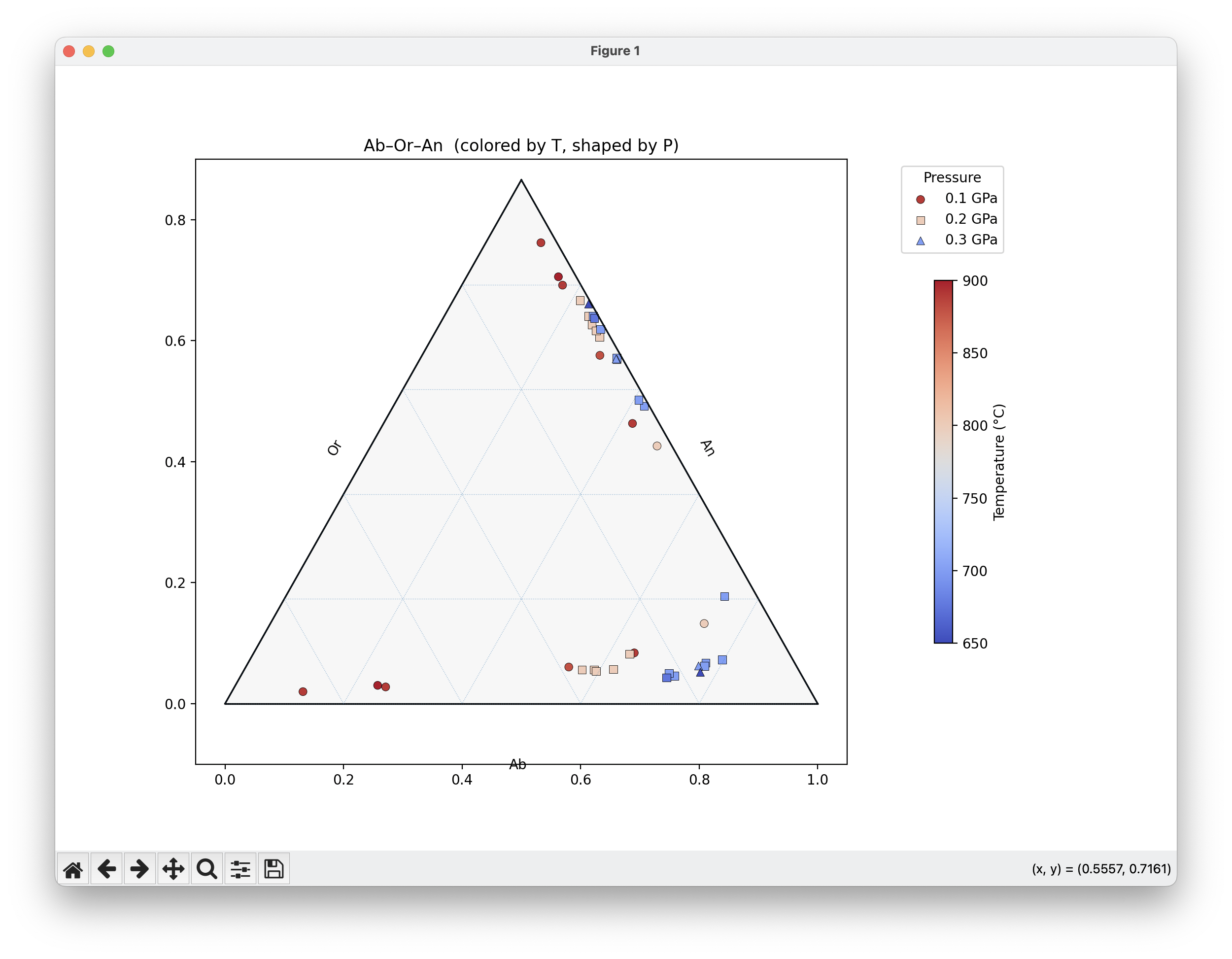
Two Panels
fig, axes = plt.subplots(1, 2, figsize=(11, 5))
titles = ['Alkali Feldspar', 'Plagioclase']
feldspars = ['Alkalai', 'Plagioclase']

for ax, title, fsp in zip(axes, titles, feldspars):
    tax = ternary.TernaryAxesSubplot(ax=ax, scale=1.0)
    tax.boundary(lw=1.2); tax.gridlines(multiple=0.2, lw=0.5, alpha=0.5)
    sub = df[df['Feldspar']==fsp]
    points = sub[['Ab','Or','An']].to_numpy()
    # Map temprature to color
    cmap = plt.get_cmap('plasma')
    colors = cmap(sub['T.C'] / sub['T.C'].max())
    tax.scatter(points, c=colors, s=40, edgecolors='k', lw=0.3)
    tax.set_title(title)
    tax.left_axis_label("Or"); tax.right_axis_label("An"); tax.bottom_axis_label("Ab")

plt.tight_layout()
plt.show()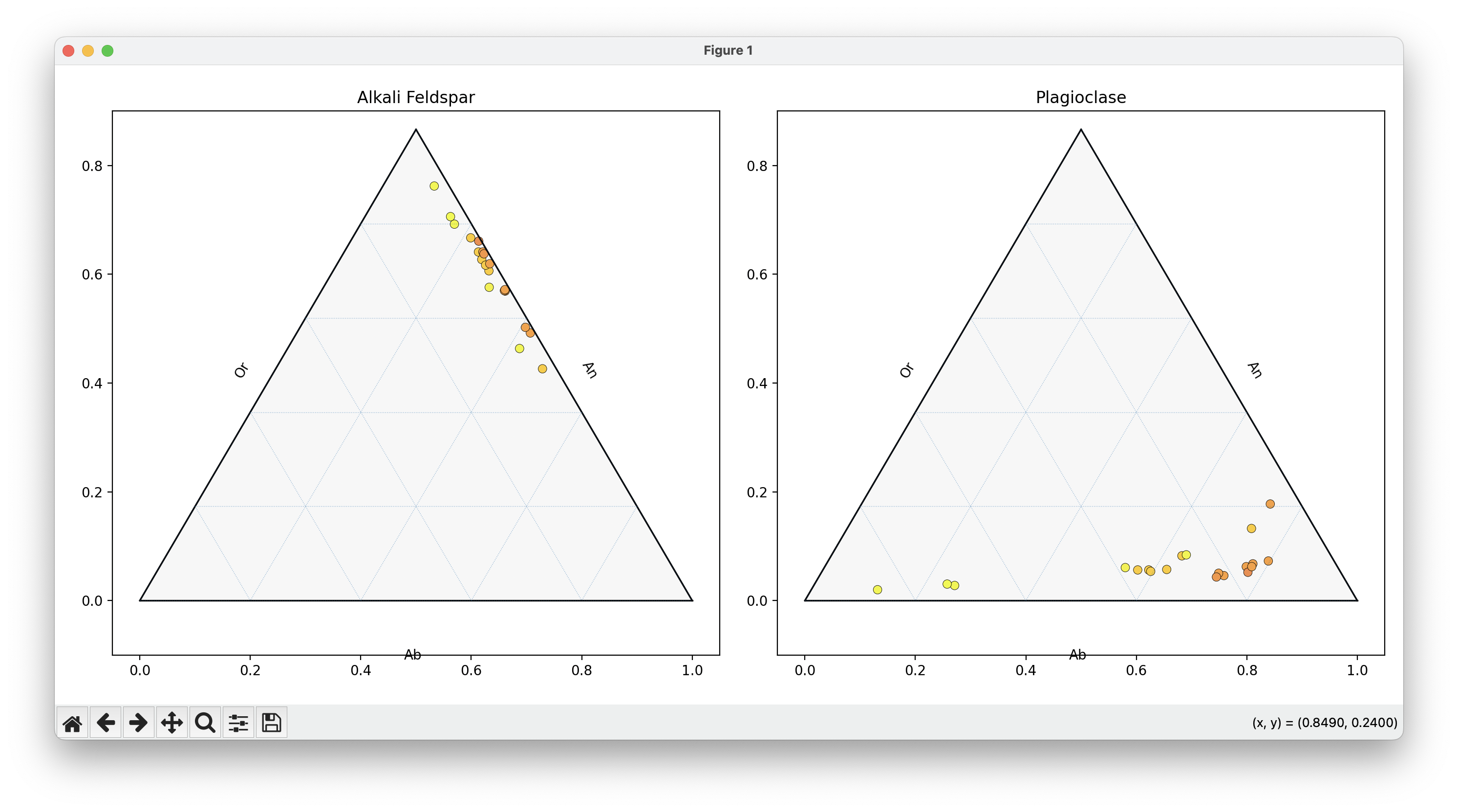
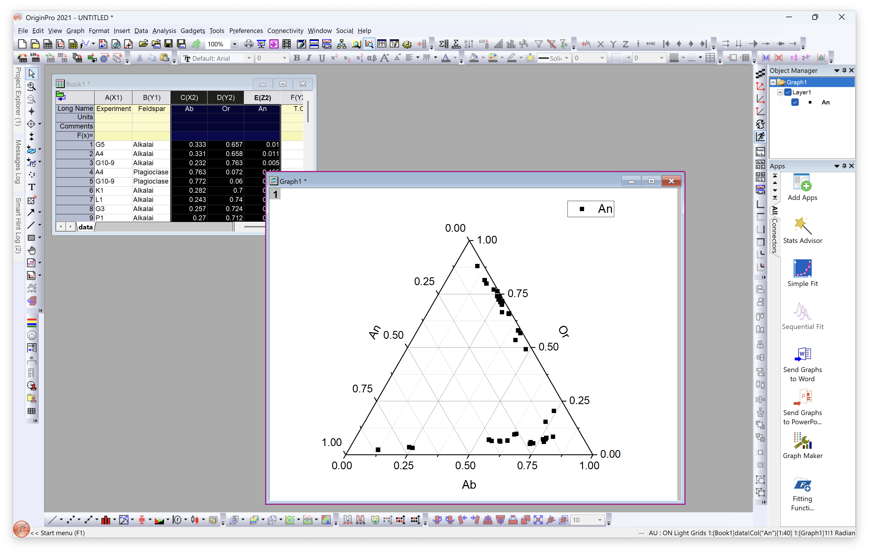
Drawing Ternary Phase Diagram with Origin
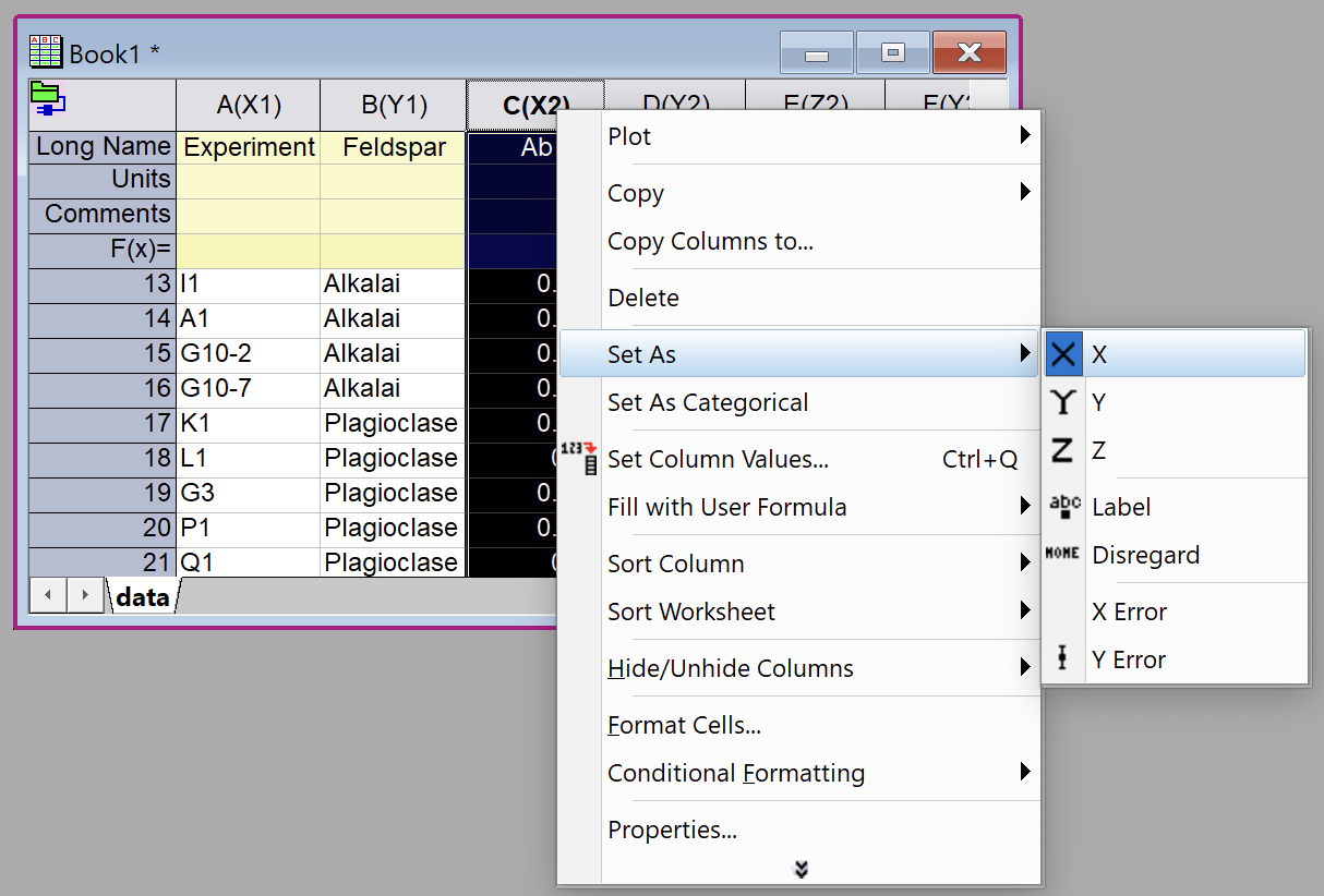
Load the Data
Drag data.csv into Origin window to import the data as Book 1
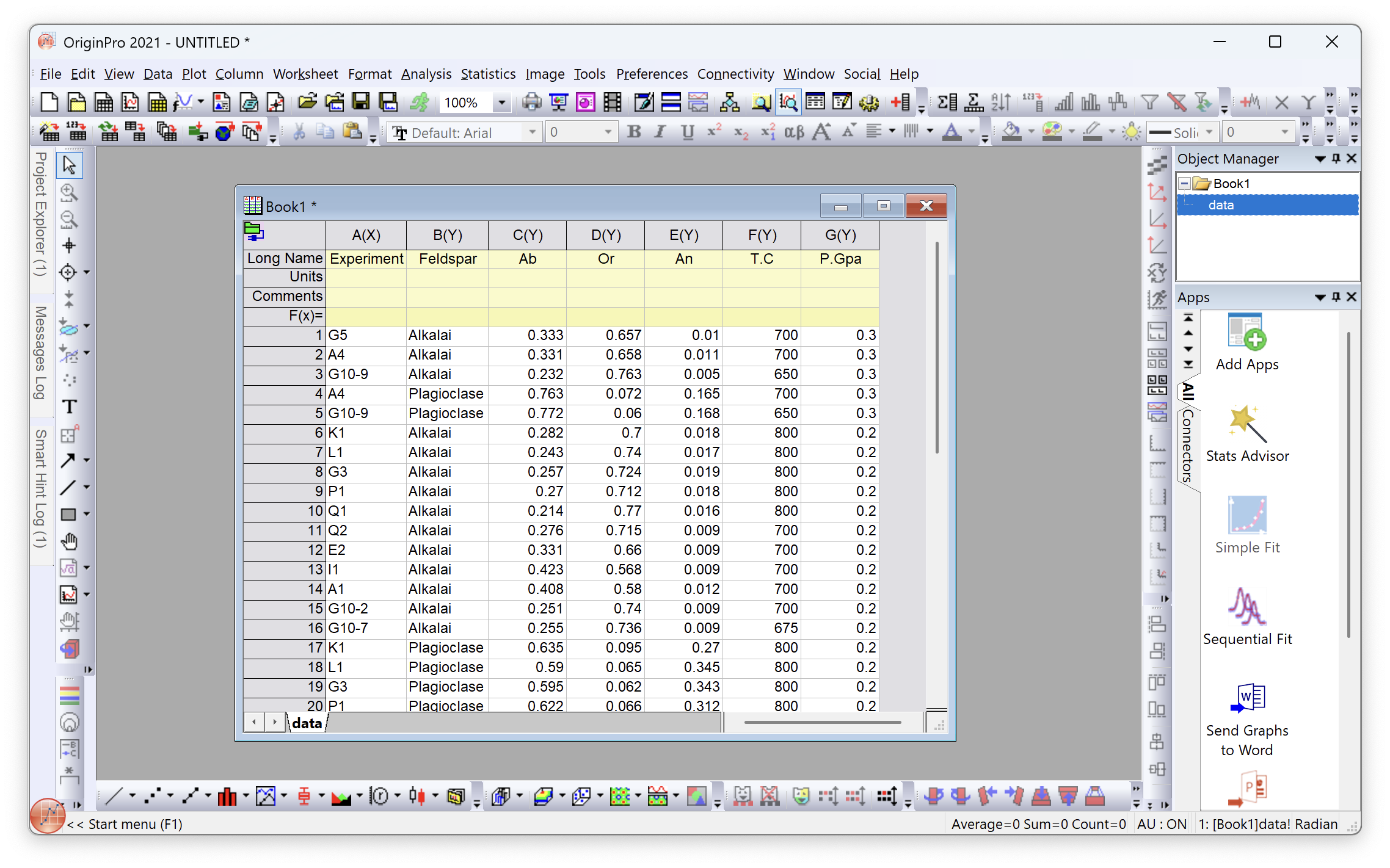
Set Ab, Or, An as X, Y, Z respectively
Basic Ternary Phase Diagram
Select Ab, Or, An and chose Plot - Specialized - Ternary