About the Treemap Chart
In information visualization and computing, treemapping is a method for displaying hierarchical data using nested figures, usually rectangles.
Treemaps display hierarchical (tree-structured) data as a set of nested rectangles. Each branch of the tree is given a rectangle, which is then tiled with smaller rectangles representing sub-branches. A leaf node’s rectangle has an area proportional to a specified dimension of the data.[1] Often the leaf nodes are colored to show a separate dimension of the data.
When the color and size dimensions are correlated in some way with the tree structure, one can often easily see patterns that would be difficult to spot in other ways, such as whether a certain color is particularly prevalent. A second advantage of treemaps is that, by construction, they make efficient use of space. As a result, they can legibly display thousands of items on the screen simultaneously.
Example data is from R package treemapify, you can obtain it by
library(treemapify)
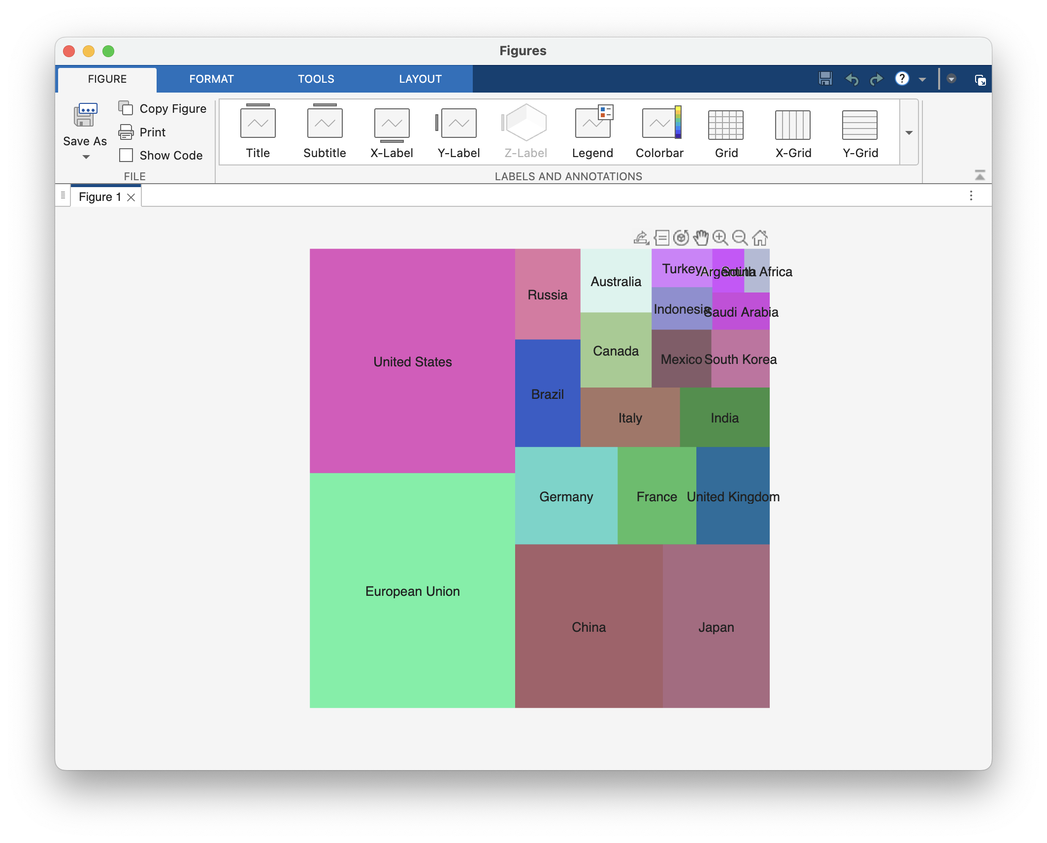
write.csv(G20, "data.csv", row.names=FALSE)Draw Treemap Chart with R
Basic Treemap
library(ggplot2)
library(treemapify)

data = read.csv("data.csv")

ggplot(data, aes(area = gdp_mil_usd, fill = hdi)) +
  geom_treemap()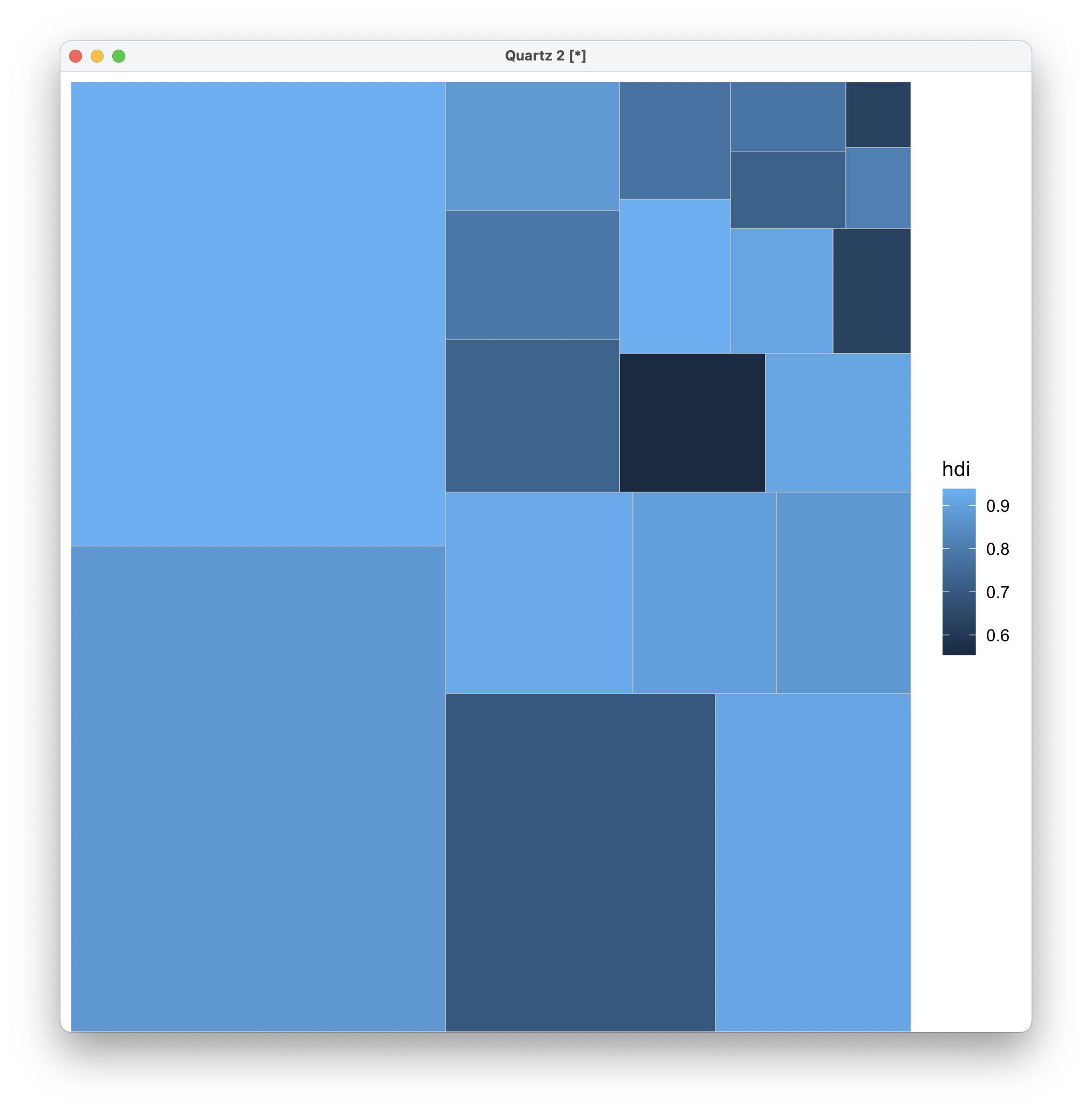
Treemap with Legend
ggplot(data, aes(area = gdp_mil_usd, fill = hdi, label = country)) +
  geom_treemap() +
  geom_treemap_text(fontface = "italic", colour = "white", place = "centre", family = "Arial",
                    grow = TRUE)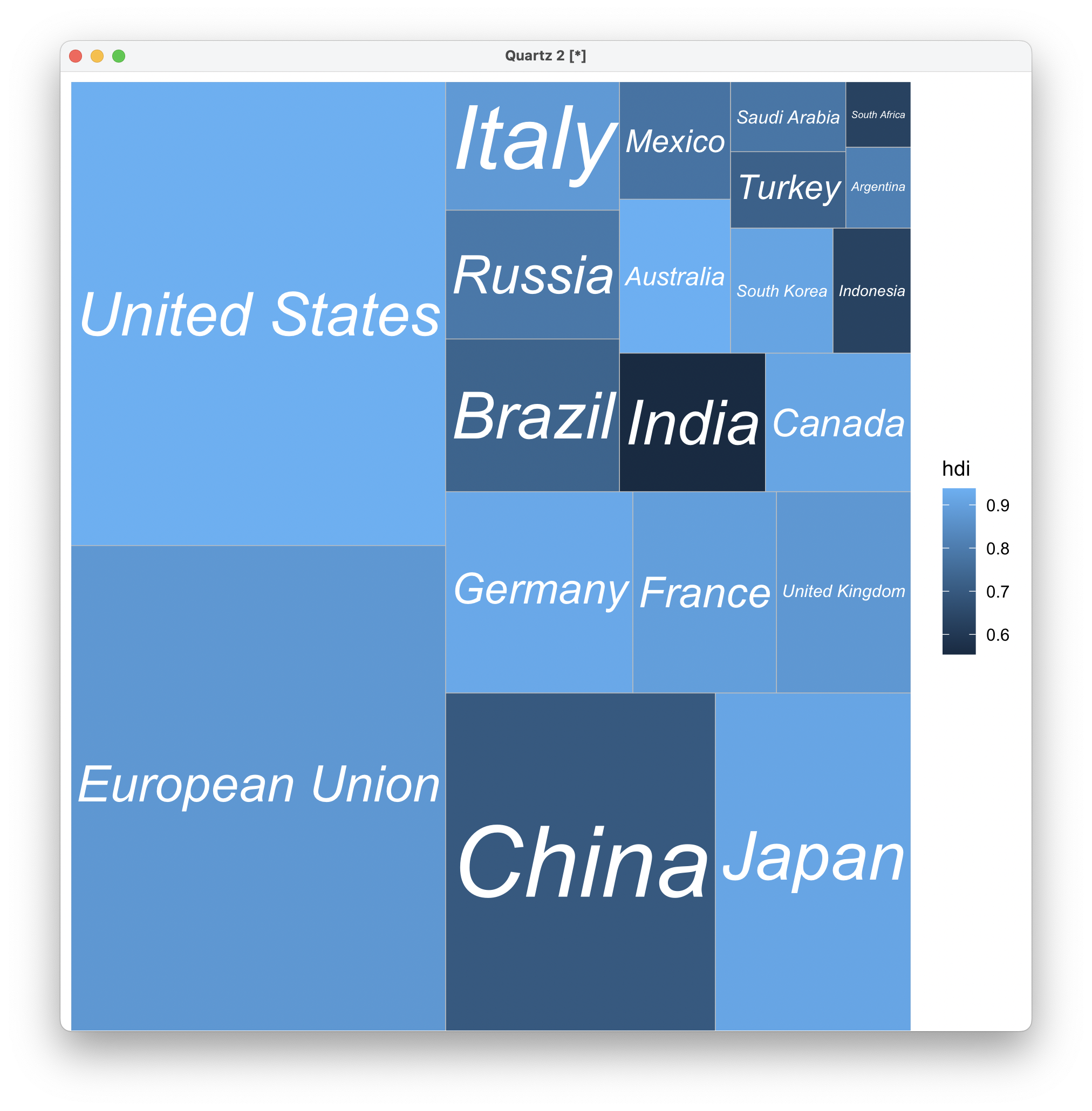
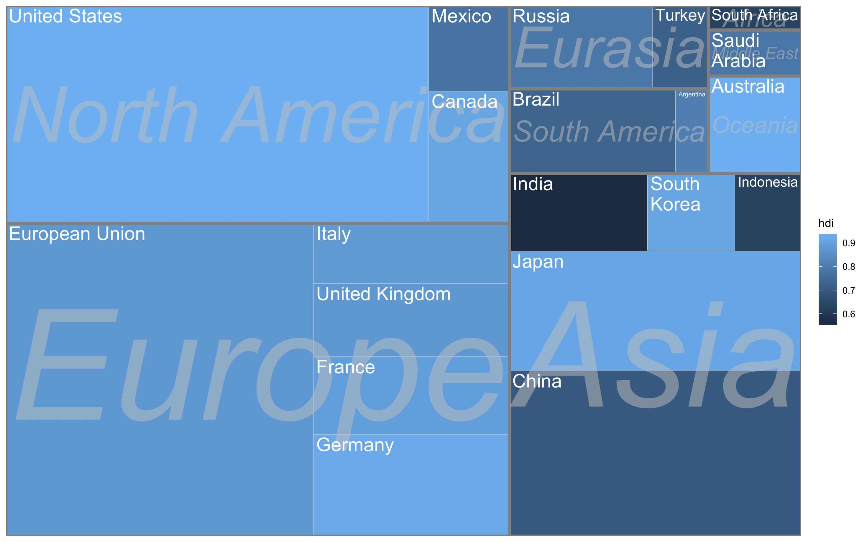
Subgrouping Tiles
ggplot(data, aes(area = gdp_mil_usd, fill = hdi, label = country,
                subgroup = region)) +
  geom_treemap() +
  geom_treemap_subgroup_border() +
  geom_treemap_subgroup_text(place = "centre", grow = T, alpha = 0.5, colour =
                             "gray", fontface = "italic", min.size = 0) +
  geom_treemap_text(colour = "white", place = "topleft", reflow = T)
Color by Region
ggplot(data, aes(area = gdp_mil_usd, fill = region, label = country)) +
  geom_treemap() +
  geom_treemap_text(grow = T, reflow = T, colour = "white", fontface = "italic") +
  theme(legend.position = "bottom")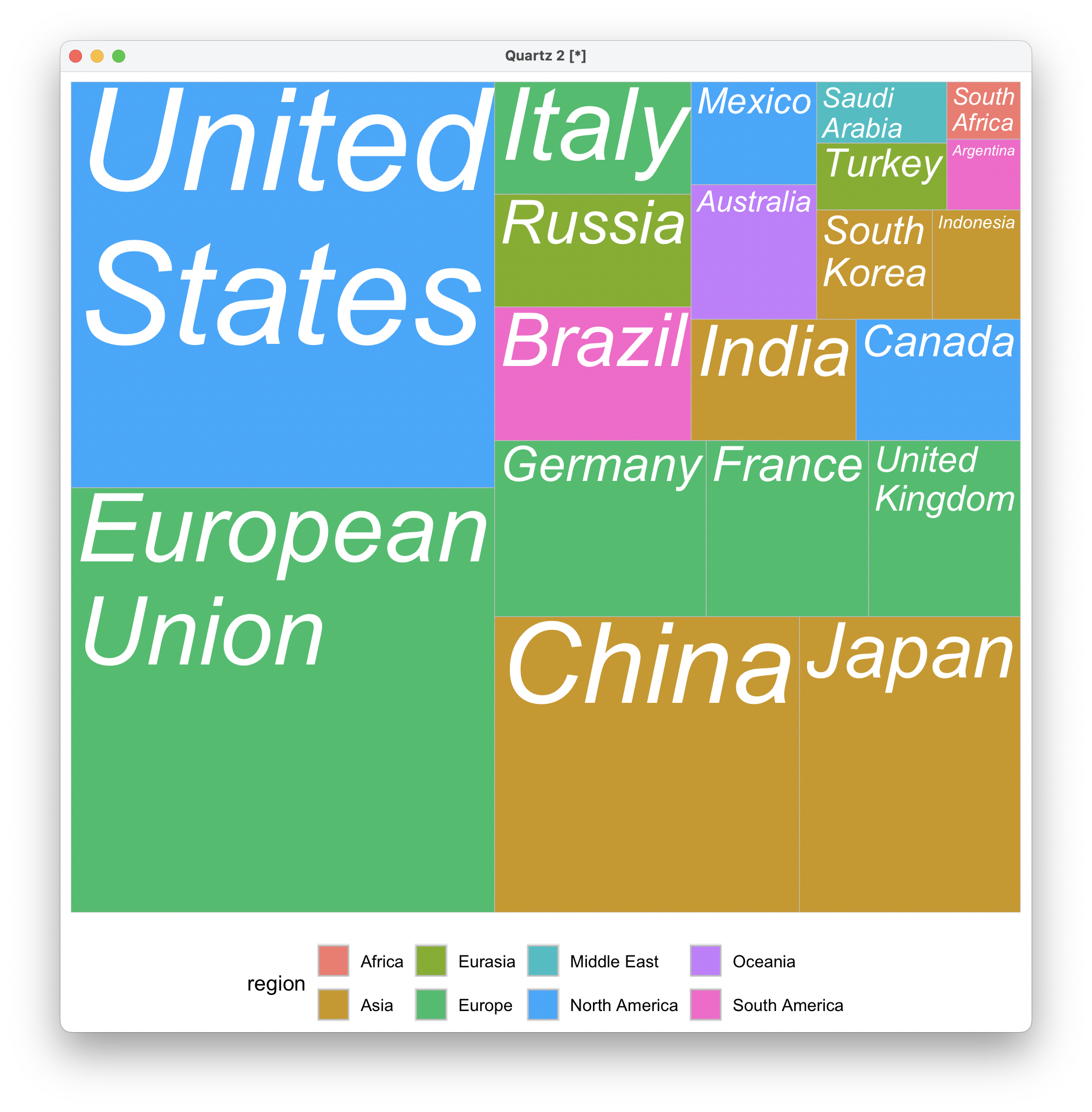
Two Panels
ggplot(data, aes(area = gdp_mil_usd, fill = hdi, label = country)) +
  geom_treemap() +
  geom_treemap_text(grow = T, reflow = T, colour = "white", fontface = "italic") +
  facet_wrap( ~ econ_classification)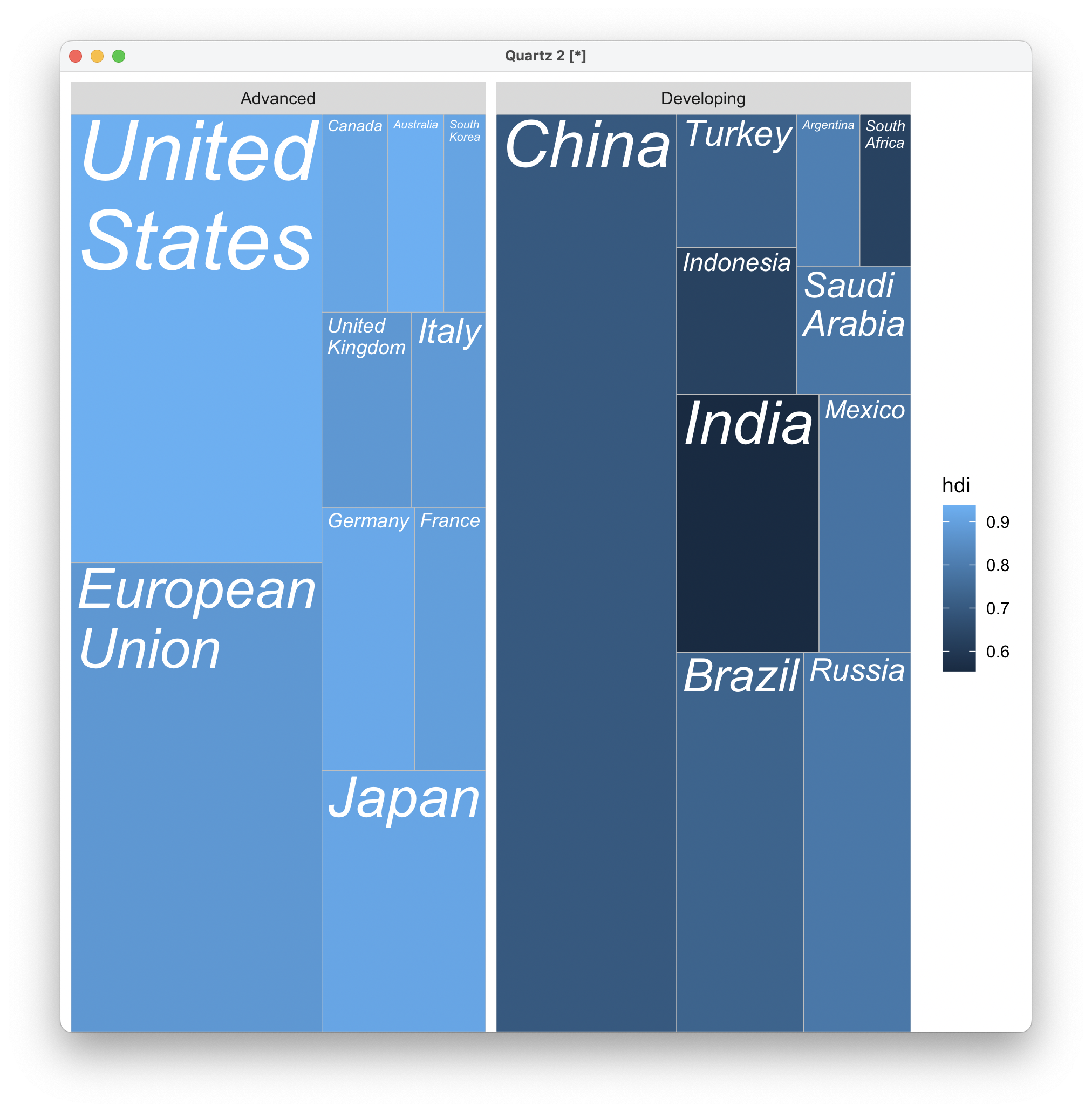
Draw Treemap Chart with Python
import pandas as pd
import matplotlib.pyplot as plt
import squarify
import matplotlib.colors as mcolors

df = pd.read_csv('data.csv')

# Color mapping: HDI → 0.5~1.0 maps to `Blues`
norm = mcolors.Normalize(vmin=0.5, vmax=1.0)
cmap = plt.cm.Blues
colors = cmap(norm(df['hdi']))

plt.figure(figsize=(12, 8))
squarify.plot(sizes=df['gdp_mil_usd'],
              label=df['country'],
              color=colors,
              alpha=0.85,
              text_kwargs={'fontsize': 9, 'weight': 'bold'})

plt.title('World GDP Treemap (colored by HDI)', fontsize=18, pad=20)
sm = plt.cm.ScalarMappable(cmap=cmap, norm=norm)
sm.set_array([])
plt.colorbar(sm, shrink=0.7, label='Human Development Index (HDI)')
plt.axis('off')
plt.tight_layout()
plt.show()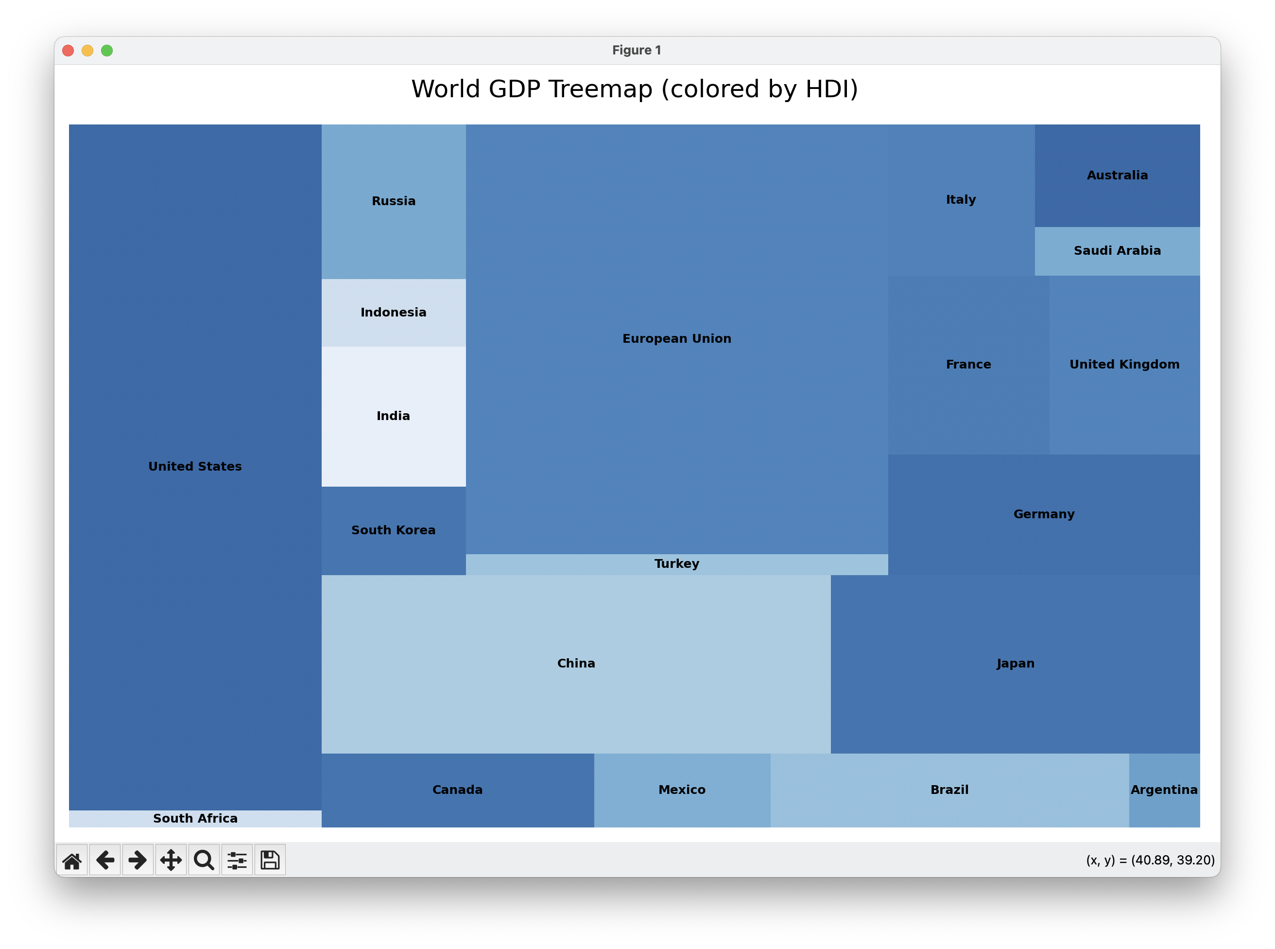
Draw Treemap Chart with MATLAB
Download Treemap
data = readtable('data.csv');

rectangles = treemap(data.gdp_mil_usd);
labels = data.country;

fig=figure;

plotRectangles(rectangles,labels)